Interactive Plots ¶¶
FiftyOne provides a powerful fiftyone.core.plots framework that contains
a variety of interactive plotting methods that enable you to visualize your
datasets and uncover patterns that are not apparent from inspecting either the
raw media files or
aggregate statistics.
With FiftyOne, you can visualize geolocated data on maps, generate interactive evaluation reports such as confusion matrices and PR curves, create dashboards of custom statistics, and even generate low-dimensional representations of your data that you can use to identify data clusters corresponding to model failure modes, annotation gaps, and more.
What do we mean by interactive plots? First, FiftyOne plots are powered by Plotly, which means they are responsive JavaScript-based plots that can be zoomed, panned, and lasso-ed. Second, FiftyOne plots can be linked to the FiftyOne App, so that selecting points in a plot will automatically load the corresponding samples/labels in the App (and vice versa) for you to visualize! Linking plots to their source media is a paradigm that should play a critical part in any visual dataset analysis pipeline.
The builtin plots provided by FiftyOne are chosen to help you analyze and improve the quality of your datasets and models, with minimal customization required on your part to get started. At the same time, data/model interpretability is not a narrowly-defined space that can be fully automated. That’s why FiftyOne’s plotting framework is highly customizable and extensible, all by writing pure Python (no JavaScript knowledge required).
Note
Check out the tutorials page for in-depth walkthroughs that apply the available interactive plotting methods to perform evaluation, identify model failure modes, recommend new samples for annotation, and more!
Overview ¶¶
All Session instances provide a
plots attribute attribute that
you can use to attach ResponsivePlot instances to the FiftyOne App.
When ResponsivePlot instances are attached to a Session, they are
automatically updated whenever
session.view changes for any
reason, whether you modify your view in the App, or programmatically change it
by setting session.view, or if
multiple plots are connected and another plot triggers a Session update!
Note
Interactive plots are currently only supported in Jupyter notebooks. In the
meantime, you can still use FiftyOne’s plotting features in other
environments, but you must manually call
plot.show() to update the
state of a plot to match the state of a connected Session, and any
callbacks that would normally be triggered in response to interacting with
a plot will not be triggered.
See this section for more information.
The two main classes of ResponsivePlot are explained next.
Interactive plots ¶¶
InteractivePlot is a class of plots that are bidirectionally linked to a
Session via the IDs of either samples or individual labels in the dataset.
When the user performs a selection in the plot, the
session.view is automatically
updated to select the corresponding samples/labels, and, conversely, when
session.view changes, the contents
of the current view is automatically selected in the plot.
Examples of InteractivePlot types include
scatterplots,
location scatterplots, and
interactive heatmaps.
View plots ¶¶
ViewPlot is a class of plots whose state is automatically updated whenever
the current session.view changes.
View plots can be used to construct dynamic dashboards that
update to reflect the contents of your current view.
More view plot types are being continually added to the library over time.
Current varieties include CategoricalHistogram, NumericalHistogram, and
ViewGrid.
Working in notebooks ¶¶
The recommended way to work with FiftyOne’s interactive plots is in Jupyter notebooks or JupyterLab.
In these environments, you can leverage the full power of plots by attaching them to the FiftyOne App and bidirectionally interacting with the plots and the App to identify interesting subsets of your data.
Note
Support for interactive plots in non-notebook contexts and in
Google Colab and
Databricks
is coming soon! In the meantime, you can still use FiftyOne’s plotting
features in these environments, but you must manually call
plot.show() to update the
state of a plot to match the state of a connected Session, and any
callbacks that would normally be triggered in response to interacting with
a plot will not be triggered.
You can get setup to work in a Jupyter environment by running the commands below for your environment:
If you wish to use the matplotlib backend for any interactive plots, refer
to this section for setup instructions.
Visualizing embeddings ¶¶
The FiftyOne Brain provides a powerful
compute_visualization() method
that can be used to generate low-dimensional representations of the
samples/object patches in a dataset that can be visualized using interactive
FiftyOne plots.
To learn more about the available embedding methods, dimensionality reduction techniques, and their applications to dataset analysis, refer to this page. In this section, we’ll just cover the basic mechanics of creating scatterplots and interacting with them.
Note
The visualizations in this section are rendered under the hood via the
scatterplot() method, which
you can directly use to generate interactive plots for arbitrary 2D or 3D
representations of your data.
Standalone plots ¶¶
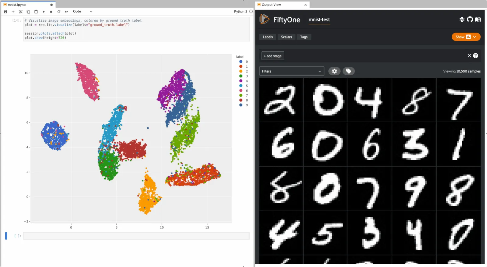
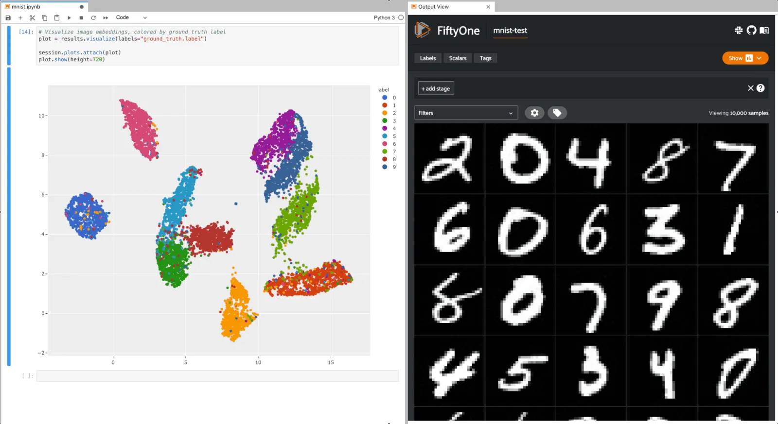
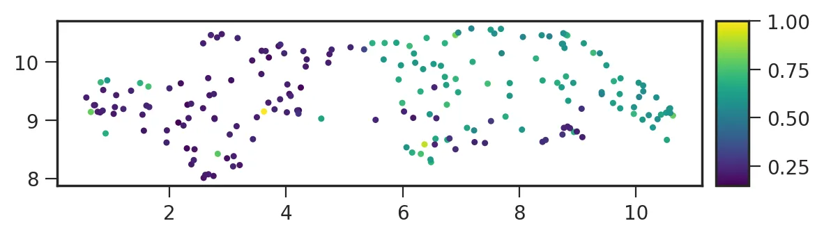
Let’s use
compute_visualization() to
generate a 2D visualization of the images in the test split of the
MNIST dataset and then visualize it using the
results.visualize()
method of the returned results object, where each point is colored by its
ground truth label:
import cv2
import numpy as np

import fiftyone as fo
import fiftyone.brain as fob
import fiftyone.zoo as foz

dataset = foz.load_zoo_dataset("mnist", split="test")

# Construct a `num_samples x num_pixels` array of images
images = np.array([\
    cv2.imread(f, cv2.IMREAD_UNCHANGED).ravel()\
    for f in dataset.values("filepath")\
])

# Compute 2D embeddings
results = fob.compute_visualization(dataset, embeddings=images, seed=51)

# Visualize embeddings, colored by ground truth label
plot = results.visualize(labels="ground_truth.label")
plot.show(height=720)
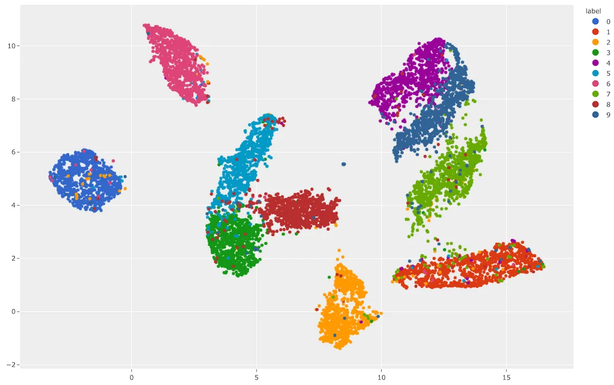
As you can see, the 2D embeddings are naturally clustered according to their ground truth label!
Interactive plots ¶¶
The full power of
compute_visualization() comes
when you associate the scatterpoints with the samples or objects in a Dataset
and then attach it to a Session.
The example below demonstrates setting up an interactive scatterplot for the test split of the MNIST dataset that is attached to the App.
In this setup, the scatterplot renders each sample using its corresponding 2D
embedding generated by
compute_visualization(), colored
by the sample’s ground truth label.
Since the labels argument to
results.visualize()
is categorical, each class is rendered as its own trace and you can click on
the legend entries to show/hide individual classes, or double-click to
show/hide all other classes.
When points are lasso-ed in the plot, the corresponding
samples are automatically selected in the session’s current
view. Likewise, whenever you
modify the session’s view, either in the App or by programmatically setting
session.view, the corresponding
locations will be selected in the scatterplot.
Each block in the example code below denotes a separate cell in a Jupyter notebook:
import cv2
import numpy as np

import fiftyone as fo
import fiftyone.brain as fob
import fiftyone.zoo as foz

dataset = foz.load_zoo_dataset("mnist", split="test")

# Construct a `num_samples x num_pixels` array of images
images = np.array([\
    cv2.imread(f, cv2.IMREAD_UNCHANGED).ravel()\
    for f in dataset.values("filepath")\
])

# Compute 2D embeddings
results = fob.compute_visualization(dataset, embeddings=images, seed=51)

session = fo.launch_app(dataset)
# Visualize embeddings, colored by ground truth label
plot = results.visualize(labels="ground_truth.label")
plot.show(height=720)

session.plots.attach(plot)
To give a taste of the possible interactions, let’s hide all zero digit images and select the other digits near the zero cluster; this isolates the non-zero digit images in the App that are likely to be confused as zeros:
Alternatively, let’s hide all classes except the zero digits, and then select the zero digits that are not in the zero cluster; this isolates the zero digit images in the App that are likely to be confused as other digits:
Geolocation plots ¶¶
You can use
location_scatterplot()
to generate interactive plots of datasets with geolocation data.
You can store arbitrary location data in
GeoJSON format on your datasets
using the GeoLocation and GeoLocations label types. See
this section for more information.
The
location_scatterplot()
method only supports simple [longitude, latitude] coordinate points, which
can be stored in the point attribute of a GeoLocation field.
Note
Did you know? You can create location-based views that filter your data by their location!
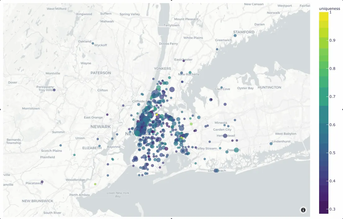
Standalone plots ¶¶
In the simplest case, you can use this method to generate a location
scatterplot for a list of [longitude, latitude] coordinates, using the
optional labels and sizes parameters to control the color and sizes
of each point, respectively.
The example below demonstrates this usage using the
quickstart-geo dataset from the zoo, which
contains GeoLocation data in its location field:
import fiftyone as fo
import fiftyone.brain as fob
import fiftyone.zoo as foz
from fiftyone import ViewField as F
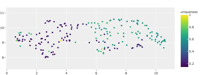
dataset = foz.load_zoo_dataset("quickstart-geo")
fob.compute_uniqueness(dataset)
# A list of ``[longitude, latitude]`` coordinates
locations = dataset.values("location.point.coordinates")
# Scalar `uniqueness` values for each sample
uniqueness = dataset.values("uniqueness")
# The number of ground truth objects in each sample
num_objects = dataset.values(F("ground_truth.detections").length())
# Create scatterplot
plot = fo.location_scatterplot(
locations=locations,
labels=uniqueness, # color points by their `uniqueness` values
sizes=num_objects, # scale point sizes by number of objects
labels_title="uniqueness",
sizes_title="objects",
)
plot.show()
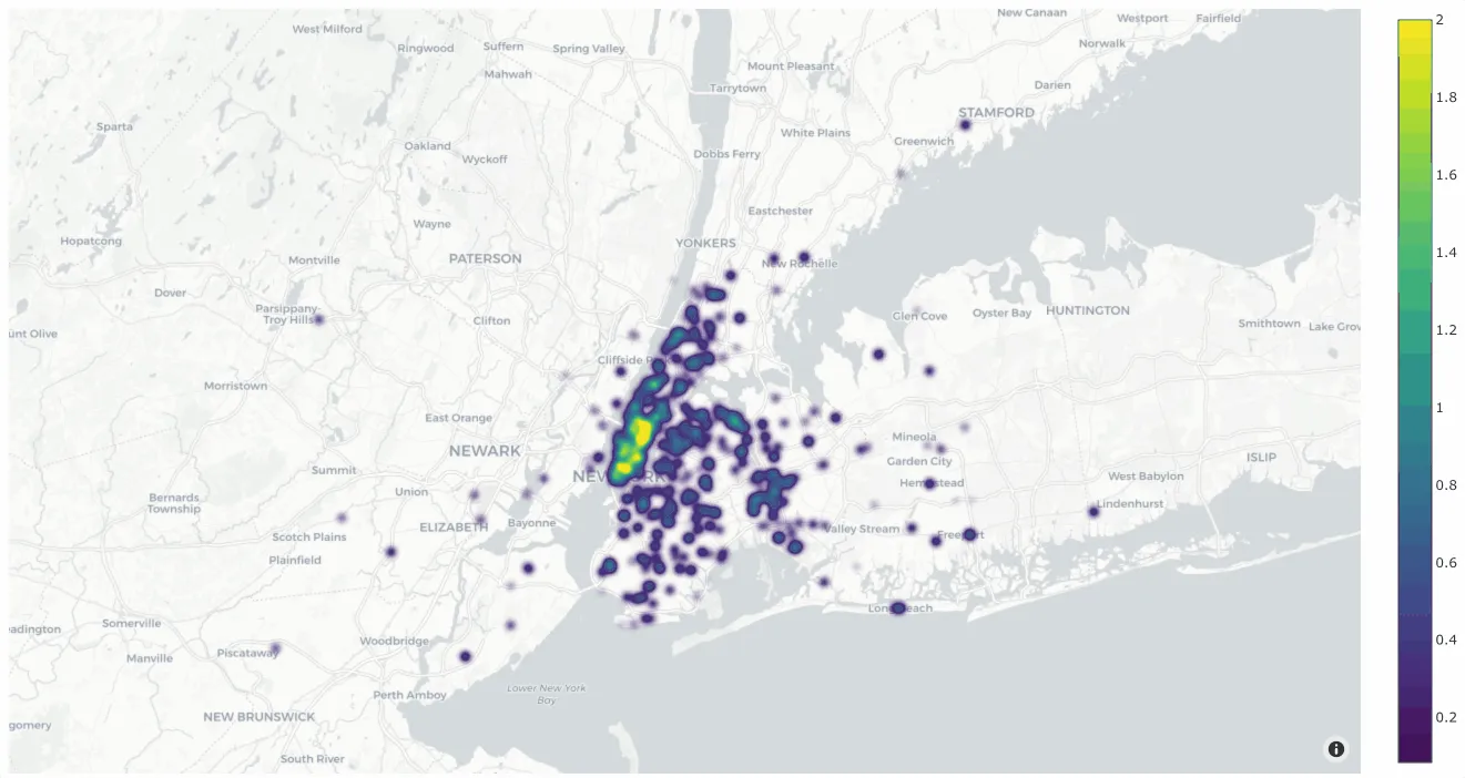
You can also change the style to style="density" in order to view the data
as a density plot:
# Create density plot
plot = fo.location_scatterplot(
    locations=locations,
    labels=uniqueness,      # color points by their `uniqueness` values
    sizes=num_objects,      # scale influence by number of objects
    style="density",
    radius=10,
)
plot.show()
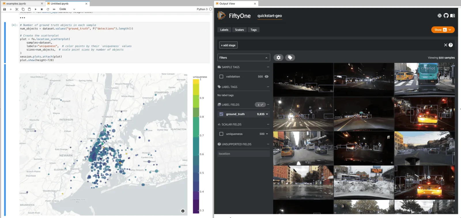
Interactive plots ¶¶
The real power of
location_scatterplot()
comes when you associate the location coordinates with the samples in a
Dataset and then attach it to a Session.
The example below demonstrates setting up an interactive location scatterplot for the quickstart-geo dataset that is attached to the App.
In this setup, the location plot renders each sample using its corresponding
[longitude, latitude] coordinates from the dataset’s only GeoLocation
field, location. When points are lasso-ed in the plot, the corresponding
samples are automatically selected in the session’s current
view. Likewise, whenever you
modify the Session’s view, either in the App or by programmatically setting
session.view, the corresponding
locations will be selected in the scatterplot.
Each block in the example code below denotes a separate cell in a Jupyter notebook:
import fiftyone as fo
import fiftyone.brain as fob
import fiftyone.zoo as foz

dataset = foz.load_zoo_dataset("quickstart-geo")
fob.compute_uniqueness(dataset)

session = fo.launch_app(dataset)
from fiftyone import ViewField as F

# Computes the number of ground truth objects in each sample
num_objects = F("ground_truth.detections").length()

# Create the scatterplot
plot = fo.location_scatterplot(
    samples=dataset,
    labels="uniqueness",    # color points by their `uniqueness` values
    sizes=num_objects,      # scale point sizes by number of objects
    sizes_title="objects",
)
plot.show(height=720)

session.plots.attach(plot)
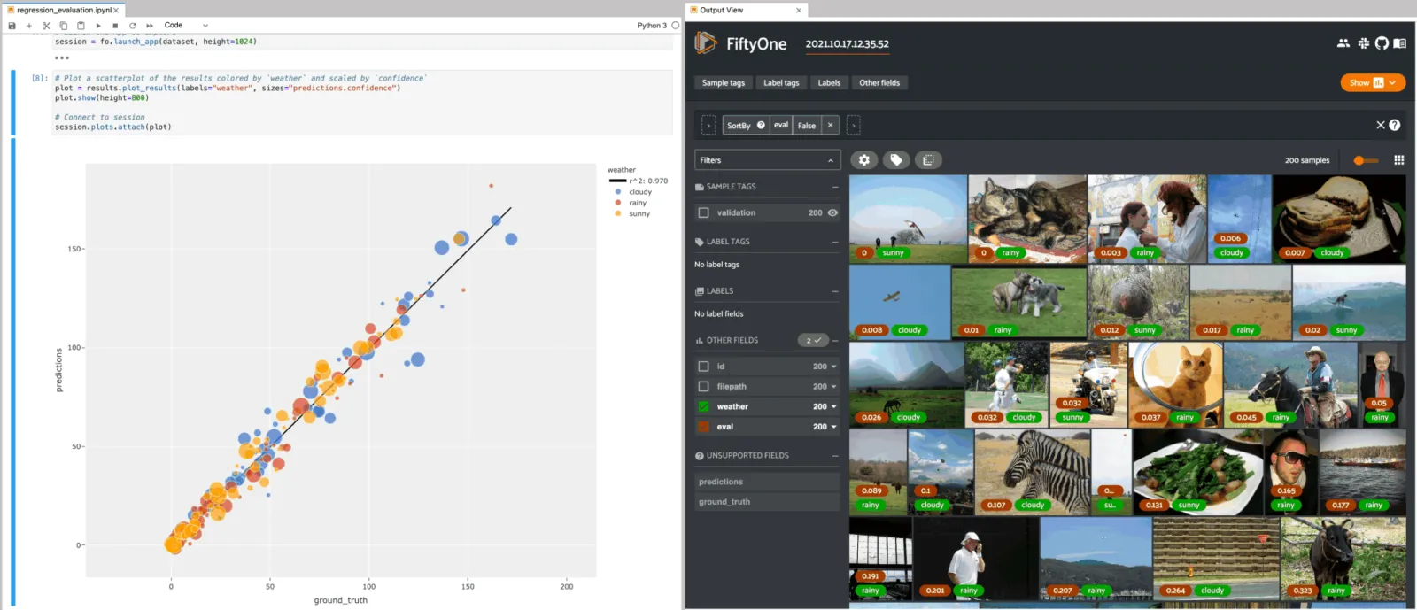
Regression plots ¶¶
When you use evaluation methods such as
evaluate_regressions()
to evaluate model predictions, the regression plots that you can generate by
calling the plot_results()
method are responsive plots that can be attached to App instances to
interactively explore specific cases of your model’s performance.
Note
See this page for an in-depth guide to using FiftyOne to evaluate regression models.
The example below demonstrates using an interactive regression plot to explore the results of some fake regression data on the quickstart dataset.
In this setup, you can lasso scatter points to select the corresponding samples in the App.
Likewise, whenever you modify the Session’s view, either in the App or by
programmatically setting
session.view, the regression plot
is automatically updated to select the scatter points that are included in the
current view.
Each block in the example code below denotes a separate cell in a Jupyter notebook:
import random
import numpy as np

import fiftyone as fo
import fiftyone.zoo as foz
from fiftyone import ViewField as F

dataset = foz.load_zoo_dataset("quickstart").select_fields().clone()

# Populate some fake regression + weather data
for idx, sample in enumerate(dataset, 1):
    ytrue = random.random() * idx
    ypred = ytrue + np.random.randn() * np.sqrt(ytrue)
    confidence = random.random()
    sample["ground_truth"] = fo.Regression(value=ytrue)
    sample["predictions"] = fo.Regression(value=ypred, confidence=confidence)
    sample["weather"] = random.choice(["sunny", "cloudy", "rainy"])
    sample.save()

# Evaluate the predictions in the `predictions` field with respect to the
# values in the `ground_truth` field
results = dataset.evaluate_regressions(
    "predictions",
    gt_field="ground_truth",
    eval_key="eval",
)

session = fo.launch_app(dataset)
# Plot a scatterplot of the results colored by `weather` and scaled by
# `confidence`
plot = results.plot_results(labels="weather", sizes="predictions.confidence")
plot.show()

session.plots.attach(plot)
Line plots ¶¶
You can use lines() to generate
interactive line plots whose points represent data associated with the samples,
frames, or labels of a dataset. These plots can then be attached to App
instances to interactively explore specific slices of your dataset based on
their corresponding line data.
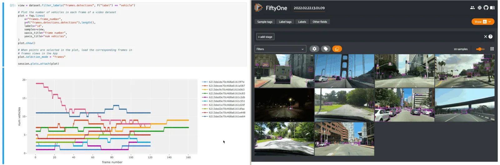
The example below demonstrates using an interactive lines plot to view the frames of the quickstart-video dataset that contain the most vehicles. In this setup, you can lasso scatter points to select the corresponding frames in a frames view in the App.
Each block in the example code below denotes a separate cell in a Jupyter notebook:
import fiftyone as fo
import fiftyone.zoo as foz
from fiftyone import ViewField as F

dataset = foz.load_zoo_dataset("quickstart-video").clone()

# Ensure dataset has sampled frames available so we can use frame selection
dataset.to_frames(sample_frames=True)

session = fo.launch_app(dataset)
view = dataset.filter_labels("frames.detections", F("label") == "vehicle")

# Plot the number of vehicles in each frame of a video dataset
plot = fo.lines(
    x="frames.frame_number",
    y=F("frames.detections.detections").length(),
    labels="id",
    samples=view,
    xaxis_title="frame number",
    yaxis_title="num vehicles",
)
plot.show()

# When points are selected in the plot, load the corresponding frames in
# frames views in the App
plot.selection_mode = "frames"

session.plots.attach(plot)
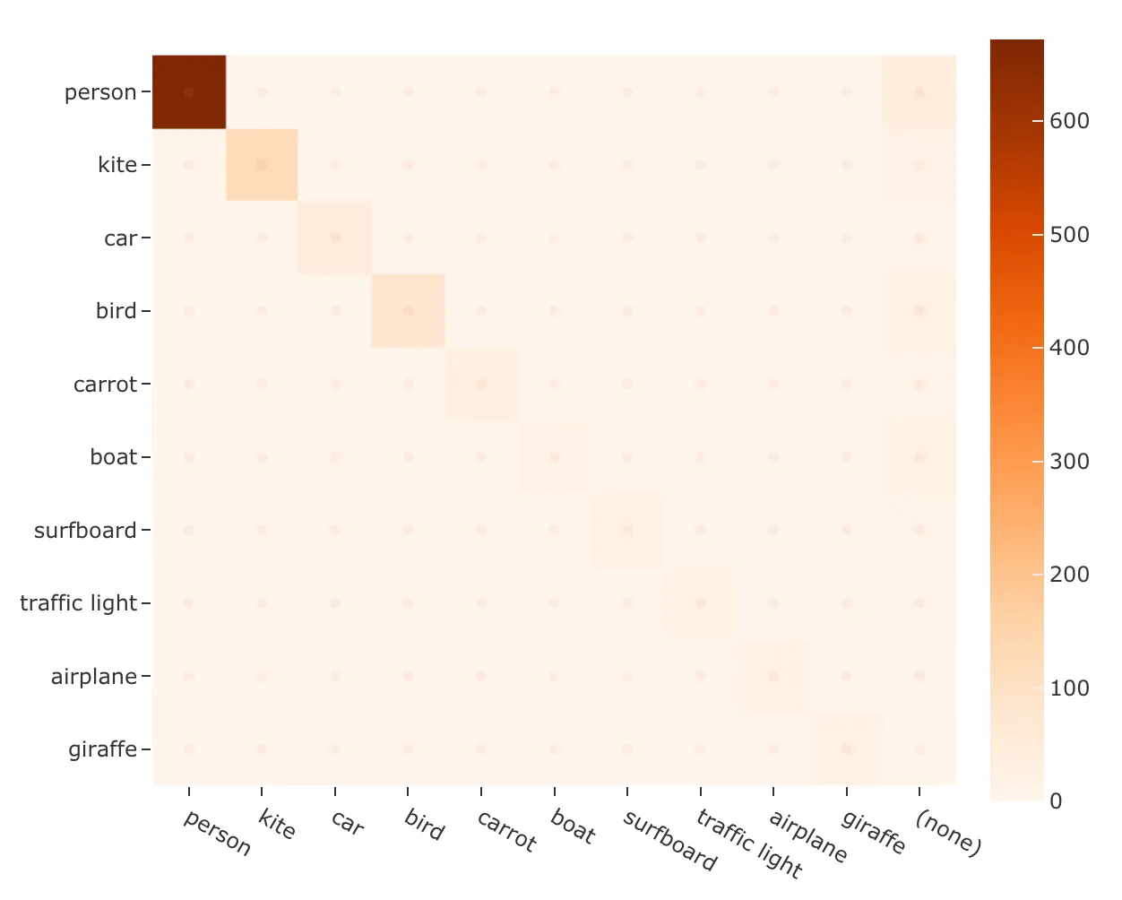
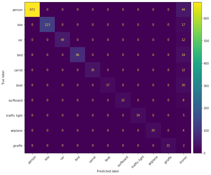
Confusion matrices ¶¶
When you use evaluation methods such as
evaluate_classifications()
and
evaluate_detections()
to evaluate model predictions, the confusion matrices that you can generate
by calling the
plot_confusion_matrix()
method are responsive plots that can be attached to App instances to
interactively explore specific cases of your model’s performance.
Note
See this page for an in-depth guide to using FiftyOne to evaluate models.
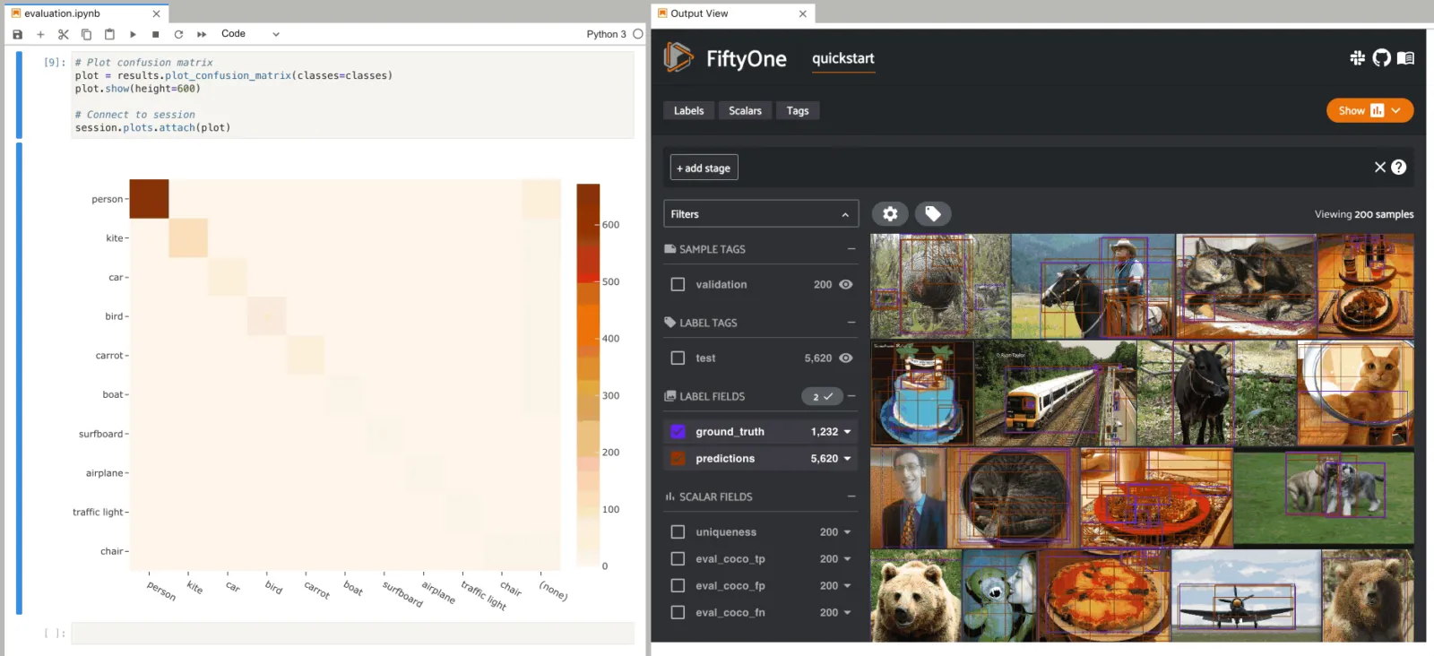
The example below demonstrates using an interactive confusion matrix to explore
the results of an evaluation on the predictions field of the
quickstart dataset.
In this setup, you can click on individual cells of the confusion matrix to
select the corresponding ground truth and/or predicted Detections in the App.
For example, if you click on a diagonal cell of the confusion matrix, you will
see the true positive examples of that class in the App.
Likewise, whenever you modify the Session’s view, either in the App or by
programmatically setting
session.view, the confusion matrix
is automatically updated to show the cell counts for only those detections that
are included in the current view.
Each block in the example code below denotes a separate cell in a Jupyter notebook:
import fiftyone as fo
import fiftyone.zoo as foz
from fiftyone import ViewField as F

dataset = foz.load_zoo_dataset("quickstart")

# Evaluate detections in the `predictions` field
results = dataset.evaluate_detections("predictions", gt_field="ground_truth")

# The top-10 most common classes
counts = dataset.count_values("ground_truth.detections.label")
classes = sorted(counts, key=counts.get, reverse=True)[:10]

session = fo.launch_app(dataset)
# Plot confusion matrix
plot = results.plot_confusion_matrix(classes=classes)
plot.show(height=600)

session.plots.attach(plot)
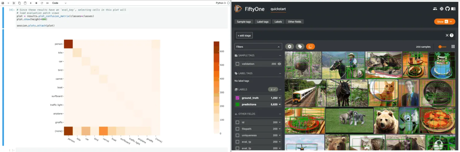
When you pass an eval_key to
evaluate_detections(),
confusion matrices attached to App instances have a different default behavior:
when you select cell(s), the corresponding
evaluation patches for the run are shown in the
App. This allows you to visualize each TP, FP, and FN example in a fine-grained
manner:
results = dataset.evaluate_detections(
    "predictions", gt_field="ground_truth", eval_key="eval"
)
# Since these results have an `eval_key`, selecting cells in this plot will
# load evaluation patch views
plot = results.plot_confusion_matrix(classes=classes)
plot.show(height=600)

session.plots.attach(plot)
If you prefer a different selection behavior, you can simply change the plot’s selection mode.
View plots ¶¶
ViewPlot is a class of plots whose state is automatically updated whenever
the current session.view changes.
Current varieties of view plots include CategoricalHistogram,
NumericalHistogram, and ViewGrid.
Note
New ViewPlot subclasses will be continually added over time, and it is
also straightforward to implement your own custom view plots. Contributions
are welcome at https://github.com/voxel51/fiftyone!
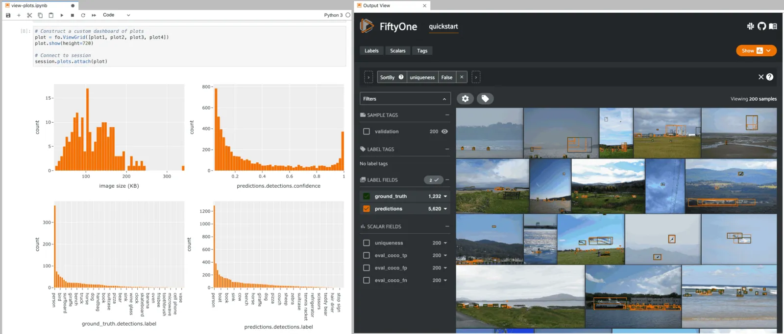
The example below demonstrates the use of ViewGrid to construct a dashboard
of histograms of various aspects of a dataset, which can then be attached to a
Session in order to automatically see how the statistics change when the
session’s view is modified.
Each block in the example code below denotes a separate cell in a Jupyter notebook:
import fiftyone as fo
import fiftyone.zoo as foz
from fiftyone import ViewField as F

dataset = foz.load_zoo_dataset("quickstart")
dataset.compute_metadata()

# Define some interesting plots
plot1 = fo.NumericalHistogram(F("metadata.size_bytes") / 1024, bins=50, xlabel="image size (KB)")
plot2 = fo.NumericalHistogram("predictions.detections.confidence", bins=50, range=[0, 1])
plot3 = fo.CategoricalHistogram("ground_truth.detections.label", order="frequency")
plot4 = fo.CategoricalHistogram("predictions.detections.label", order="frequency")

session = fo.launch_app(dataset)
# Construct a custom dashboard of plots
plot = fo.ViewGrid([plot1, plot2, plot3, plot4], init_view=dataset)
plot.show(height=720)

session.plots.attach(plot)
Attaching plots to the App ¶¶
All Session instances provide a
plots attribute that you can use
to attach ResponsivePlot instances to the FiftyOne App.
When ResponsivePlot instances are attached to a Session, they are
automatically updated whenever
session.view changes for any
reason, whether you modify your view in the App, or programmatically change it
by setting session.view, or if
multiple plots are connected and another plot triggers a Session update!
Note
Interactive plots are currently only supported in Jupyter notebooks. In the
meantime, you can still use FiftyOne’s plotting features in other
environments, but you must manually call
plot.show() to update the
state of a plot to match the state of a connected Session, and any
callbacks that would normally be triggered in response to interacting with
a plot will not be triggered.
See this section for more information.
Attaching a plot ¶¶
The code below demonstrates the basic pattern of connecting a ResponsivePlot
to a Session:
import fiftyone as fo
import fiftyone.zoo as foz

dataset = foz.load_zoo_dataset("quickstart-geo")

session = fo.launch_app(dataset)

# Create a responsive location plot
plot = fo.location_scatterplot(samples=dataset)
plot.show()  # show the plot

# Attach the plot to the session
# Updates will automatically occur when the plot/session are updated
session.plots.attach(plot)
You can view details about the plots attached to a Session by printing it:
print(session)
Dataset:          quickstart-geo
Media type:       image
Num samples:      500
Selected samples: 0
Selected labels:  0
Session URL:      http://localhost:5151/
Connected plots:
    plot1: fiftyone.core.plots.plotly.InteractiveScatter
By default, plots are given sequential names plot1, plot2, etc., but
you can customize their names via the optional name parameter of
session.plots.attach().
You can retrieve a ResponsivePlot instance from its connected session by its
name:
same_plot = session.plots["plot1"]
same_plot is plot  # True
Connecting and disconnecting plots ¶¶
By default, when plots are attached to a Session, they are connected, which
means that any necessary state updates will happen automatically. If you wish
to temporarily suspend updates for an individual plot, you can use
plot.disconnect():
# Disconnect an individual plot
# Plot updates will no longer update the session, and vice versa
plot.disconnect()

# Note that `plot1` is now disconnected
print(session)
Dataset:          quickstart-geo
Media type:       image
Num samples:      500
Selected samples: 0
Selected labels:  0
Session URL:      http://localhost:5151/
Disconnected plots:
    plot1: fiftyone.core.plots.plotly.InteractiveScatter
You can reconnect a plot by calling
plot.connect():
# Reconnect an individual plot
plot.connect()

# Note that `plot1` is connected again
print(session)
Dataset:          quickstart-geo
Media type:       image
Num samples:      500
Selected samples: 0
Selected labels:  0
Session URL:      http://localhost:5151/
Connected plots:
    plot1: fiftyone.core.plots.plotly.InteractiveScatter
You can disconnect and reconnect all plots currently attached to a Session
via
session.plots.disconnect()
and
session.plots.connect(),
respectively.
Detaching plots ¶¶
If you would like to permanently detach a plot from a Session, use
session.plots.pop() or
session.plots.remove():
# Detach plot from its session
plot = session.plots.pop("plot1")

# Note that `plot1` no longer appears
print(session)
Dataset:          quickstart-geo
Media type:       image
Num samples:      500
Selected samples: 0
Selected labels:  0
Session URL:      http://localhost:5151/
Freezing plots ¶¶
Working with interactive plots in notebooks is an amazingly productive experience. However, when you find something particularly interesting that you want to save, or you want to share a notebook with a colleague without requiring them to rerun all of the cells to reproduce your results, you may want to freeze your responsive plots.
You can conveniently freeze your currently active App instance and any attached
plots by calling
session.freeze():
# Replace current App instance and all attached plots with static images
session.freeze()
After calling this method, your current App instance and all connected plots will be replaced by static images that will be visible when you save + reopen your notebook later.
You can also freeze an individual plot by calling
plot.freeze():
# Replace a plot with a static image
plot.freeze()
You can “revive” frozen App and plot instances by simply rerunning the notebook cells in which they were defined and shown.
Note
session.freeze() and
plot.freeze() are
only applicable when working in notebook contexts.
Saving plots ¶¶
You can use plot.save() to save
any InteractivePlot or ViewPlot as a static image or HTML.
Consult the documentation of your plot’s
save() method for details on
configuring the export.
For example, you can save a histogram view plot:
import fiftyone as fo
import fiftyone.zoo as foz

dataset = foz.load_zoo_dataset("quickstart")

plot = fo.CategoricalHistogram(
    "ground_truth.detections.label",
    order="frequency",
    log=True,
    init_view=dataset,
)

plot.save("./histogram.jpg", scale=2.0)

Or you can save an embedding scatterplot:
import fiftyone.brain as fob

results = fob.compute_visualization(dataset)

plot = results.visualize(labels="uniqueness", axis_equal=True)
plot.save("./embeddings.png", height=300, width=800)
You can also save plots generated using the matplotlib backend:
plot = results.visualize(
    labels="uniqueness",
    backend="matplotlib",
    ax_equal=True,
    marker_size=5,
)
plot.save("./embeddings-matplotlib.png", dpi=200)
Advanced usage ¶¶
Customizing plot layouts ¶¶
The plot.show() method used to
display plots in FiftyOne supports optional keyword arguments that you can use
to customize the look-and-feel of plots.
In general, consult the documentation of the relevant
plot.show() method for details on
the supported parameters.
If you are using the default plotly backend,
plot.show() will accept any valid
keyword arguments for plotly.graph_objects.Figure.update_layout().
The examples below demonstrate some common layout customizations that you may wish to perform:
# Increase the default height of the figure, in pixels
plot.show(height=720)

# Equivalent of `axis("equal")` in matplotlib
plot.show(yaxis_scaleanchor="x")
Note
Refer to the plotly layout documentation for a full list of the supported options.
Plot selection modes ¶¶
When working with scatterplots and interactive heatmaps that are linked to frames or labels, you may prefer to see different views loaded in the App when you make a selection in the plot. For example, you may want to see the corresponding objects in a patches view, or you may wish to see the samples containing the objects but with all other labels also visible.
You can use the
selection_mode
property of InteractivePlot instances to change the behavior of App updates
when selections are made in connected plots.
When a plot is linked to frames, the available
selection_mode
options are:
-
"select"( default): show video samples with labels only for the selected frames -
"match": show unfiltered video samples containing at least one selected frame -
"frames": show only the selected frames in a frames view
When a plot is linked to labels, the available
selection_mode
options are:
-
"patches"( default): show the selected labels in a patches view -
"select": show only the selected labels -
"match": show unfiltered samples containing at least one selected label
For example, by default, clicking on cells in a confusion matrix for a detection evaluation will show the corresponding ground truth and predicted objects in an evaluation patches view view in the App. Run the code blocks below in Jupyter notebook cells to see this:
import fiftyone as fo
import fiftyone.zoo as foz
from fiftyone import ViewField as F

dataset = foz.load_zoo_dataset("quickstart")

results = dataset.evaluate_detections(
    "predictions", gt_field="ground_truth", eval_key="eval"
)

# Get the 10 most common classes in the dataset
counts = dataset.count_values("ground_truth.detections.label")
classes = sorted(counts, key=counts.get, reverse=True)[:10]

session = fo.launch_app(dataset)
plot = results.plot_confusion_matrix(classes=classes)
plot.show(height=600)

session.plots.attach(plot, name="eval")
However, you can change this behavior by updating the
selection_mode
property of the plot like so:
# Selecting cells will now show unfiltered samples containing selected objects
plot.selection_mode = "match"
# Selecting cells will now show filtered samples containing only selected objects
plot.selection_mode = "select"
Similarly, selecting scatter points in an object embeddings visualization will show the corresponding objects in the App as a patches view:
# Continuing from the code above
session.freeze()
import fiftyone.brain as fob

results = fob.compute_visualization(
    dataset, patches_field="ground_truth", brain_key="gt_viz"
)

# Restrict visualization to the 10 most common classes
view = dataset.filter_labels("ground_truth", F("label").is_in(classes))
results.use_view(view)

session.show()
plot = results.visualize(labels="ground_truth.detections.label")
plot.show(height=800)

session.plots.attach(plot, name="gt_viz")
However, you can change this behavior by updating the
selection_mode
property of the plot:
# Selecting points will now show unfiltered samples containing selected objects
plot.selection_mode = "match"
# Selecting points will now show filtered samples containing only selected objects
plot.selection_mode = "select"
Note
The App will immediately update when you set the
selection_mode
property of an InteractivePlot connected to the App.
Plotting backend ¶¶
Most plotting methods in the fiftyone.core.plots() module provide an
optional backend parameter that you can use to control the plotting backend
used to render plots.
The default plotting backend is plotly, which is highly recommended due to
its better performance, look-and-feel, and greater support for interactivity.
However, most plot types also support the matplotlib backend. If you chose
this backend, plots will be rendered as matplotlib figures. Many
matplotlib-powered plot types support interactivity, but you must
enable this behavior:
import fiftyone as fo
import fiftyone.zoo as foz
from fiftyone import ViewField as F

dataset = foz.load_zoo_dataset("quickstart")
results = dataset.evaluate_detections("predictions", gt_field="ground_truth")

# Get the 10 most common classes in the dataset
counts = dataset.count_values("ground_truth.detections.label")
classes = sorted(counts, key=counts.get, reverse=True)[:10]
# Use the default plotly backend
plot = results.plot_confusion_matrix(classes=classes)
plot.show(height=512)
import matplotlib.pyplot as plt

# Use the matplotlib backend instead
figure = results.plot_confusion_matrix(
    classes=classes, backend="matplotlib", figsize=(10, 10)
)
plt.show(block=False)
Interactive matplotlib plots ¶¶
If you are using the matplotlib backend, many FiftyOne plots still support interactivity in notebooks, but you must enable this behavior by running the appropriate magic command in your notebook before you generate your first plot.
If you forget or choose not to run a magic command, the plots will still display, but they will not be interactive.
Follow the instructions for your environment below to enable interactive matplotlib plots: